In a digital world overflowing with emails, ads, and pop-ups, direct mail still has one big edge: it’s real. It lands in your hand, not just your inbox. But for it to work, it has to earn attention fast. Here’s how to design a direct mail piece that cuts through the noise and delivers results.
1. Single Focus
Before you open Photoshop or pick a paper stock, know exactly what you want this mailer to do. Are you:
- Driving foot traffic to a store?
- Getting calls or signups?
- Promoting a limited-time offer?
Be specific. A mailer trying to do three things usually does none.
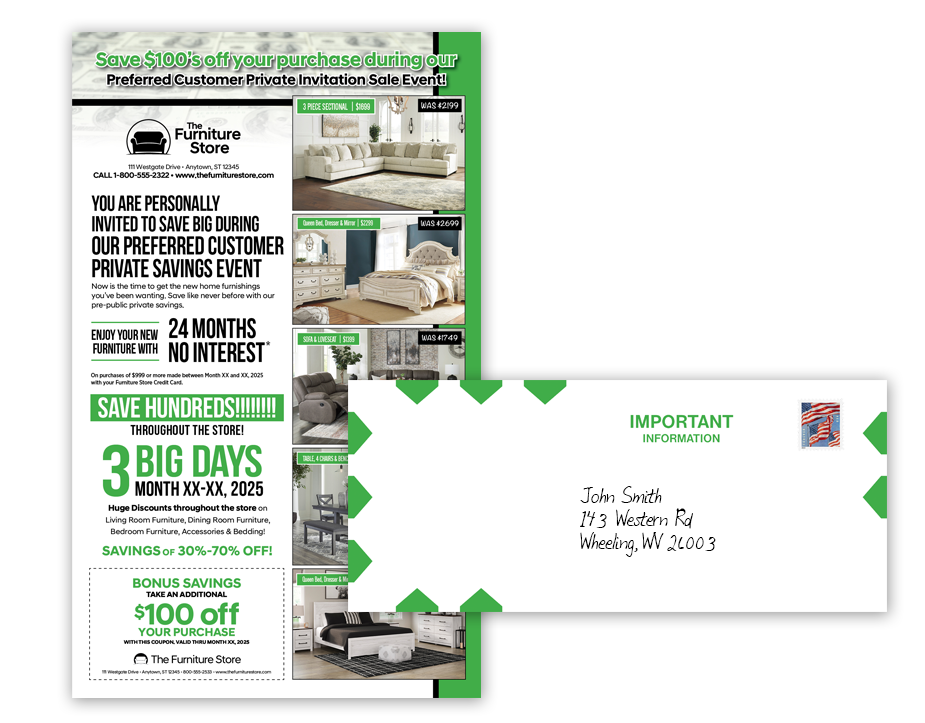
2. Use a Bold Headline
Your headline has one job: stop the reader from tossing your piece in the trash. Make it big, bold, and benefit-driven. Think like a billboard, not a brochure.
Bad:
“Introducing Our New Product Line”
Better:
“Save 40% This Week Only—No Code Needed”
You’ve got 3–5 seconds tops. Make them count.
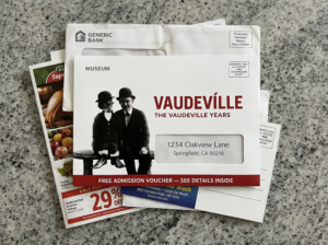
3. Use Compelling Images That Work, Not Just Fill Up Space
Every photo should earn its spot. A smiling stock photo of a generic customer? Skip it. Show the product in action. Show a result. Show something real and relevant to your offer.
If you’re selling landscaping, don’t show a mower. Show a stunning backyard transformation. Make people feel the value.
4. Focus the Copy on the Reader
This isn’t about you—it’s about what the reader gets. Your company history doesn’t belong on a postcard. Focus on the benefit, the offer, and the next step.
Use “you” more than “we.” Cut jargon. Write like a human. If it sounds like an ad, rework it until it sounds like a helpful tip or a friend’s recommendation.

5. Include a Strong, Singular Call to Action
Tell people what to do next. And make it easy.
- “Call now for a free quote.”
- “Visit us at [yourwebsite].com.”
- “Bring this card in for 20% off.”
Don’t give three different CTAs. Pick one, highlight it, and repeat it. Confused readers don’t act.
6. Design for the Medium
Direct mail isn’t a screen. It’s held, turned, tossed. Think about size, paper feel, and layout.
- Use clean, high-contrast layouts.
- Make the offer and CTA instantly visible.
- Use big fonts (especially for older audiences).
- Leave space—don’t cram every inch.
Postcards work well for quick hits. Folded mailers or letters give you more space for storytelling or complex offers.
7. Add Urgency and Scarcity
No one acts on a “someday” deal. Use deadlines, limits, and language that prompts immediate action:
- “Offer ends June 30”
- “Only 100 spots available”
- “Act now and get a bonus gift”
Can’t fake urgency. If customers catch on, you lose their trust.
Need Help Bringing It All Together?
Designing effective direct mail takes more than a clever idea—it takes execution that works in the real world. If you want expert help crafting a piece that gets noticed and gets results, consult the professionals at Mail America. With decades of experience in direct mail strategy, design, and delivery, we know what it takes to make mail that performs.